april | may | 2019
Burns Bespoke.
A British Family Reinvents Their Longtime Home
WRITTEN BY KATHRYN O’SHEA-EVANS PHOTOGRAPHY COURTESY OF OLIVER BURNS
There’s only one problem with being to the manor born, as the expression goes. Occasionally, the manor is unlivable. Perhaps it’s filled with one-too-many breakable antiques or a dowdy chintz scheme that makes it feel like a stuffy, doily-strewn bed-and-breakfast. That was exactly what London-based designer Oliver Burns, who owns this late Georgian/early Victorian brick home in the British countryside, was trying to avoid. He and his family had actually been hoping to move but ended up overhauling the house they already owned instead. “We spent four years looking for another Georgian house to turn into our forever home, but couldn’t find what we wanted. So we recreated as much of what we wanted as we could in our current home and in turn fell in love with the property all over again.”
And no wonder. The expansion and redesign made their country cottage a bastion of historic-meets-modern style that’s hard-wearing enough for all ages. “Our design brief was for a house that was luxurious but family friendly, creating a home that is great for entertaining, relaxing, and that has lots of storage,” says Burns. “Hard-wearing solutions that don’t compromise on style were nonnegotiables for us, and hence we used a lot of commercial/industrial-grade fabrics to minimize sticky fingerprints and muddy paws!”


His tactics worked. The estate retains an aura of Downton Abbey grandeur with all the luxuries of 2019. “Livable luxury was what we were aiming for; something that we could be proud of but that wasn’t too precious,” says the designer. “This is definitely a family home that is warm and cozy as well as luxurious.” And it was more than a fresh coat of paint and new decor—Burns revamped the entire property. “The year-long project more than doubled the floor space to about 4,500 square feet, adding a two-story extension to the west, an enlarged kitchen to the east, and an extra floor with a fourth bedroom suite. The illusion of high ceilings was created by raising doorways to full height while keeping the skirting and paneling lower than Georgian tradition would demand. We had the choice of a playroom or a dining room, not both, and felt that it was important that our son had his own space and also storage for toys.”
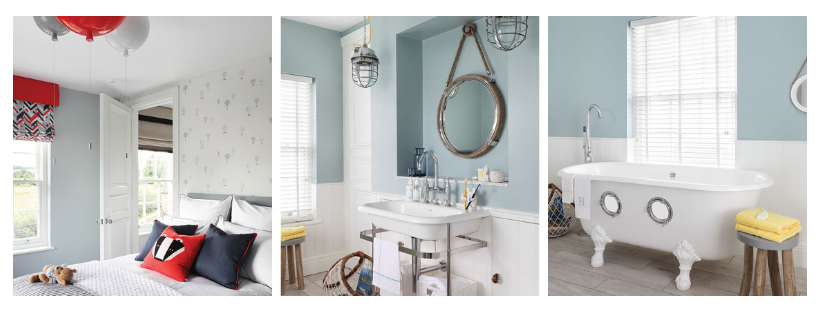
Burns’s favorite elements of the design are details so subtle it takes an expert to notice—yet when combined, they create the project’s illustrious effect. “As [I] step into the entrance hall, with its checkered gray Nero Marquina and white Carrara marble floor, I love the view up through the staircase that sweeps up three floors, curving around three bespoke lanterns that hang from the ceiling far above,” he says. Almost everything in the home was made bespoke specifically for them. “The entire handrail was created from a single piece of wood; we commissioned the beautiful marble-inlaid fireplace in the reception room and the chandelier with 1,800 hand-hung crystal droplets; and in our son Harry’s bedroom, John Moncrieff balloon lights are a colorful statement. The porthole bath in his bathroom is an original French, cast-iron, double-ended bath with portholes cut into one side; [it] brings fun to bath time whatever your age.”
The details Burns chose are, above all, personal to him and his family. Point proven: He didn’t just pick out paint chips willy-nilly at the hardware store. “The palette of blues and grays was inspired by happy memories of our honeymoon on the Amalfi coast,” says the designer. “Deep blues inspired by the Tyrrhenian Sea beautifully coalesce with soft whites and soupçons of antique gold throughout.” But perhaps the standout detail is the one that proves his design aesthetic is truly his calling, even at home. “Up the grand sweeping staircase to the master suite, Ralph Lauren pinstripe walls serve as the backdrop for a beautiful navy upholstered emperor bed.” Anything but basic and everything bespoke.

A glimmering modern chandelier evokes thoughts of gentle rain and provides a focal point in the living room.

Pinstripes, piping, and chevron fabric add buttoned-up class to the bedroom, while metallic throw pillows keep the effect lively.


Designer Style Secrets.
British designer Oliver Burns is an expert on style minutia. Here, he shares the design details from this project—each one worthy of adopting in your own abode—that he wishes more people would use.
Pattern makes perfect. “There are a lot of patterns throughout the house, from chevron prints and pinstripes through to a herringbone laid floor and an elegant, checkerboard-effect, marble entrance,” says the designer. In other words: Don’t be afraid to play.
Mix it up. “Geometric prints feature subtly on a lot of fabrics, adding depth and texture to neutrals,” he says. “Mixing them can often be a challenge, but when done in the right way, a variety of prints can add visual interest and contrast to an interior.”
Go for bamboo. Burns frequently utilizes an unexpected material for softness underfoot. “All of the bespoke rugs we designed in the house are bamboo—a more sustainable option versus silk.” What’s not to love?


