curtis casual
California Living by Way of Texas
WRITTEN BY LAUREN DUNEC HOANG
PHOTOGRAPHY BY J. TURNBOW PHOTOGRAPHY
Interior designer Ginger Curtis, owner and principal of Urbanology Designs, has always been a California girl at heart. When it came time to furnish the home she shares with her husband Eric Curtis and their five children in Fort Worth, Texas, she knew she wanted to bring in some style elements of her childhood in California, but with a fresh, contemporary update.
Enter a breezy, predominantly neutral color palette with natural wood, oat-colored linens, and vivid hits of green from potted plants. Edgy art—like a Georgian-era portrait with a stripe of yellow paint across the eyes—and a bold choice of two-tone paint for the dining room are reminders that this is the home of a forward-thinking designer. “I wanted a space that was modern and stylish but also extremely family friendly and comfortable,” says Curtis. “You shouldn’t have to sacrifice one for the other.”
When Curtis and her husband first purchased the home about five years ago, they embarked on a substantial remodel to update the early-2000s, builder-grade house to fit the needs of their growing family and give it an overall aesthetic face-lift. The remodel included updating the kitchen, replacing all flooring, repainting, and changing lighting and hardware throughout the home. More recently, Curtis turned her attention to the furnishings of the living and dining rooms to realize her vision of California casual with a contemporary twist.

The catalyst for the living space redesign was the launch of a line of sofas designed by Curtis and her team at Urbanology. “This gave me the perfect excuse to revamp and include the Urbanology sofas in my own home,” says Curtis, who anchored the design of the living room around the newly available Santa Clara sofa and Newport loveseat. Curtis designed the sofas to meet not only her clients’ needs but also those of her own family. “We thought about what everyone wants: something comfortable to pile the whole family on for movie night, but still chic enough to stand alone and make a statement. We designed our sofas to be both,” she describes.
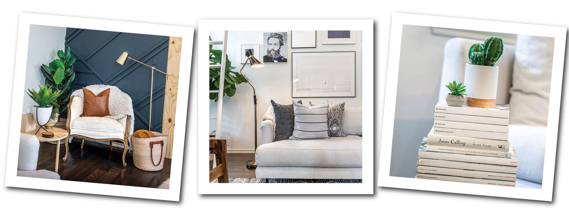
The new sofa and loveseat now sit proudly amidst a bright and airy living room where, indeed, the whole family can kick back and watch a movie together. Curtis cleverly concealed the TV behind white, barn-style doors above the fireplace. Chunky knit throws, sheepskins, and leather-accented pillows bump up the texture of the room along with stacked, ash-tree rings used as a coffee table. Tucked in the corner by the window, a rough wooden box corrals the children’s toys, organized in canvas bags. The family uses the decorative white ladder, opposite, to hang extra blankets and host seasonal decor such as string lights for the holidays.

Crate-inspired wall shelving, designed and built by designer Ginger Curtis, houses a treasure trove of her latest home finds. The custom piece doubles as storage for extra flatware, mugs, candles, and decor she uses for entertaining.

The new Urbanology Santa Clara sofa and Newport loveseat sit atop a grey diamond west elm rug and invite lounging. A cut through wall leads from the living room to the kitchen and displays a collection of terra-cotta pottery along the sill. Curtis used museum-style down lights to illuminate a modern art portrait—Emma by Josh Young—with a soft wash of light.
On the other side of the living room, Curtis created a textured accent wall using strips of wood to form a pattern and the same blue-black paint (Behr’s Submarine Gray) that appears in the dining room. “It brings some connectedness between the two rooms,” says Curtis, who designed and painted the accent wall herself. The dark hue also serves as a rich backdrop to show off an early-1900s armchair that Curtis already owned and wanted to give a place of prominence.
Curtis calls out putting together the gallery wall—which spreads across the wall above the sofa—as being one of the trickiest parts of the redecoration project. “I love so many styles—from modern and minimal to wild and bold. It really took me forever to finally choose the artwork I wanted,” say Curtis. She landed on a mix of soothing prints of the ocean, puffy clouds against a cobalt sky, and fog-laden hay fields as well as painted portraits festooned with contemporary overlays and minimalist line drawings. To nail a gallery wall, Curtis says getting the scale right and choosing pieces that speak to you and feel connected to each other is key. Here, although her art choices span many different styles, the color palette of blue-grays, off-whites, and natural browns as well as the barely-there frames make the wall feel cohesive and work with the room as a whole.
In the nearby dining room, Curtis moved away from breezy whites and neutrals by submerging the bottom section of the walls in inky blue-gray paint. “I knew I wanted to go two-tone, but I didn’t want it to be exactly halfway up the wall,” she says, opting for painting just over half to give the wall a more unique look. The dark walls envelope a ten-foot trestle dining table that’s large enough to accommodate the whole Curtis family plus guests, spread among wooden benches and Eames DSW dining chairs. Today, the family feels perfectly at home in their new living and dining spaces, largely thanks to an inviting style that suits both adults and youngsters. “The California-casual look is a very relaxed, modern style,” says Curtis. “It feels updated, but not stark or cold. Instead, it’s welcoming and perfect for a family.”


